Luminosity Masks continued
Clive R. Haynes FRPS
The next stage is to tackle those lighter areas of cloud at the top of the image. This area can be targeted by Ctrl-clicking 'Highlights 3' thumbnail in the Channels Palette. See below.
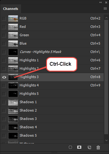
The selected area appears as Marching Ants.
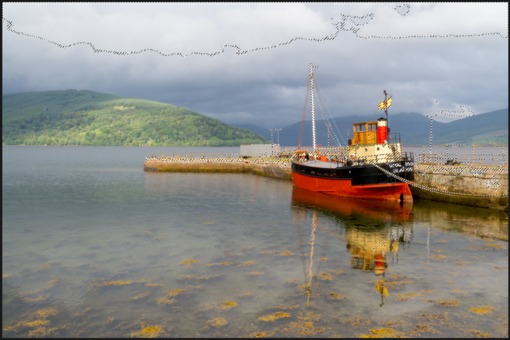
Above: Showing Alpha Channel 'Highlights 3' Selection.
The selection includes areas that are not needed. These can be removed by painting black on 'Highlights 3' Luminance Mask (Alpha Channel) thumbnail. Alternatively a copy Luminance Mask (Alpha Channel) could be made to work on. Once we have the Adjustment Layer, It really doesn't matter which method is favoured.
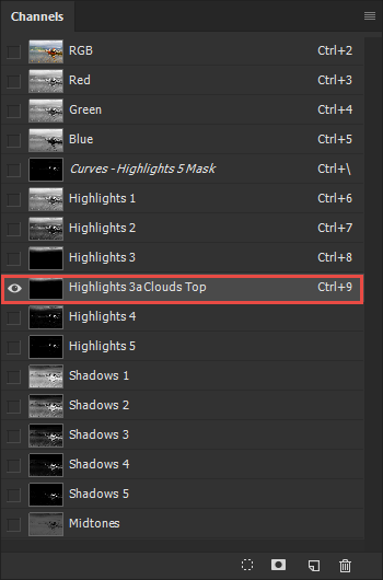
In this case I made a copy of 'Hightights 3' and labeled it 'Highlights 3a Clouds Top'. Using black I painted out areas of this Channel. To be neat, I click-dragged the channel and positioned it beneath 'Highlights 3'.
After Ctrl-clicking on 'Highlights 3a Clouds Top' Channel thumbnail, I made an Adjustment Layer for 'Curves' to reduce the exposure in this area.
The screen-grabs below show the Channels Palette and Layers Palette at this stage.
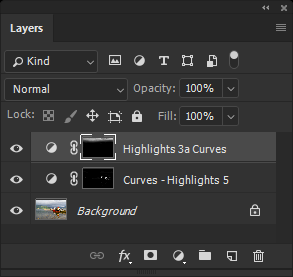
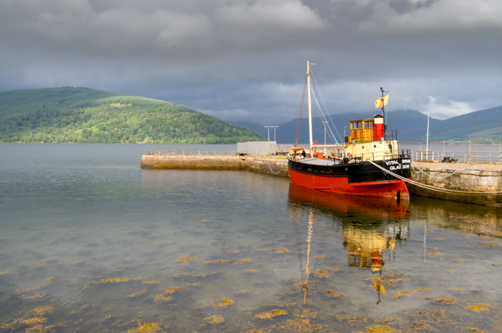
Once a selection has been made (or revealed by Ctrl-Click on an Alpha Channel or a Layer Mask), it's possible to 'inverse' the selection (Ctrl+Shift+I) to work on the 'opposite areas' with another Adjustment Layer.
Alternatively the Original Adjustment Layer can be copied, then with the Layer Mask thumbnail active, it can be made into a negative (Ctr+I). Now the Adjustment Layer will only affect the opposite areas.
Once again using the Brush Tool and Black as the foreground colour, areas that do not need the adjustment can be easily edited out.
To refine tonality I'm going to lift the black part of the hull a little. To do this I need to choose the Luminance Mask best suited to the task. In this case it's 'Shadows 5'. Ctrl - Click the Channels thumbnail for 'Shadows 5' and 'marching ants' appear.
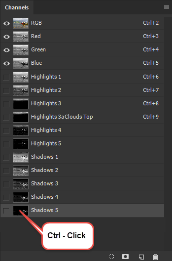
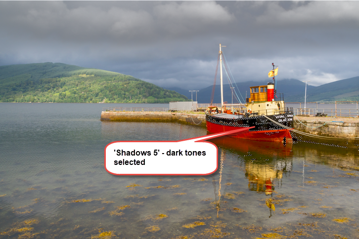
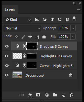
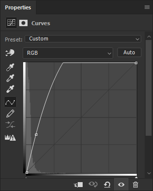
The purpose of making an accurate selections by separating tonal areas is to give pin-point targeting where it's needed. Once essential areas have been adjusted one can use less specific methods to work on the image.
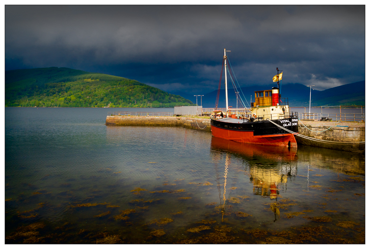
In the case of this picture I wanted to further darken and balance the sky and increase the element of drama. I completed the image by adding a Curves Adjustment Layer and darkening / 'burning in' the lower portion. The resulting image would have been much more difficult to achieve without the application of Luminosity Masks. The final image is at the base of the page. However before presenting the final image I want to return to the Midtones Luminance Mask.
More About the Midtone Luminance Mask
One very useful property of this mask to allow subtle changes to occur away from near black, black, near whites and white. Also being generally grey in tone the effects of adjustments are more nuanced. For example, subtle changes in colour tone and colour grading can be made this way. This is what to do:
In the Channels palette with the RGB Channel active, Ctrl-Click on the Midtones Luminosity Mask and a 'No pixels selected' box will appear. Click 'OK' to accept this.
In the Layers palette, click on the Adjustment Layer icon and choose Hue & Saturation. In the Hue & Saturation box, adjusting the slider positions will effect the midtone areas only. This is very different to the usual performance of Hue & Saturation when it effects the entire image. Experiment with Saturation settings and Colorize settings and you will see just what I mean. As an example I include a Colorized blue influenced version using this method side by side with a 'normal' (with no Midtone Luminosity Mask) Hue & Saturation Adjustment Layer using the same setting.
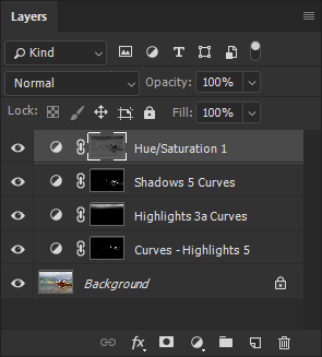
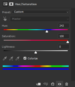
with Midtones Luminosity Mask
for the two images below.
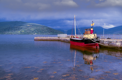
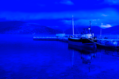
with Midtones Luminosity Mask
without Luminosity Mask
